Typography
Type choices and hierarchy were used to create clarity, rhythm, and emphasis throughout the spread.
My Respawn magazine layout is an editorial design project created to combine strong typography, visual hierarchy, and structured page composition into a polished magazine experience. The goal was to design a layout that feels bold and engaging while keeping the content easy to read and visually organized.
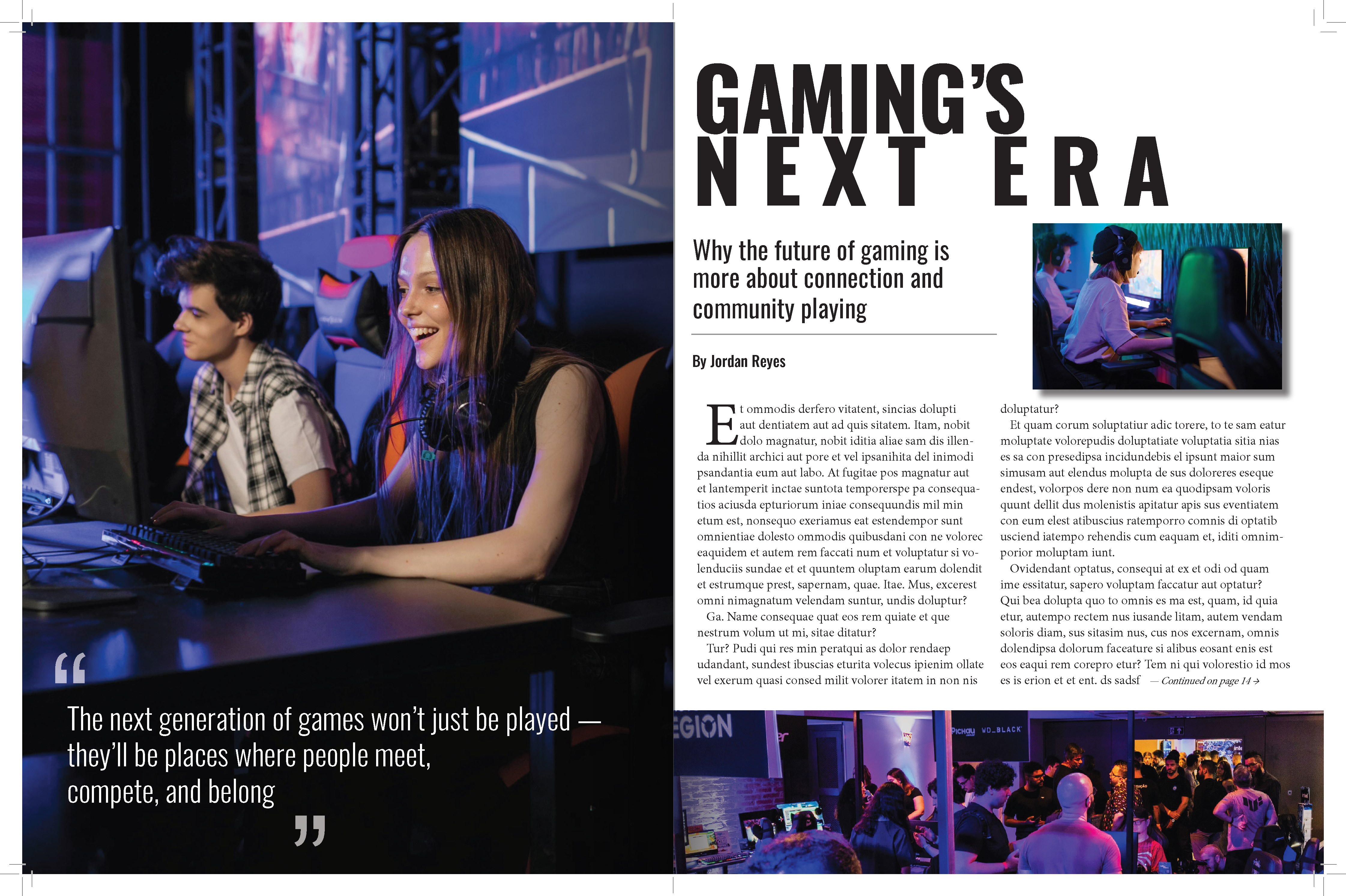
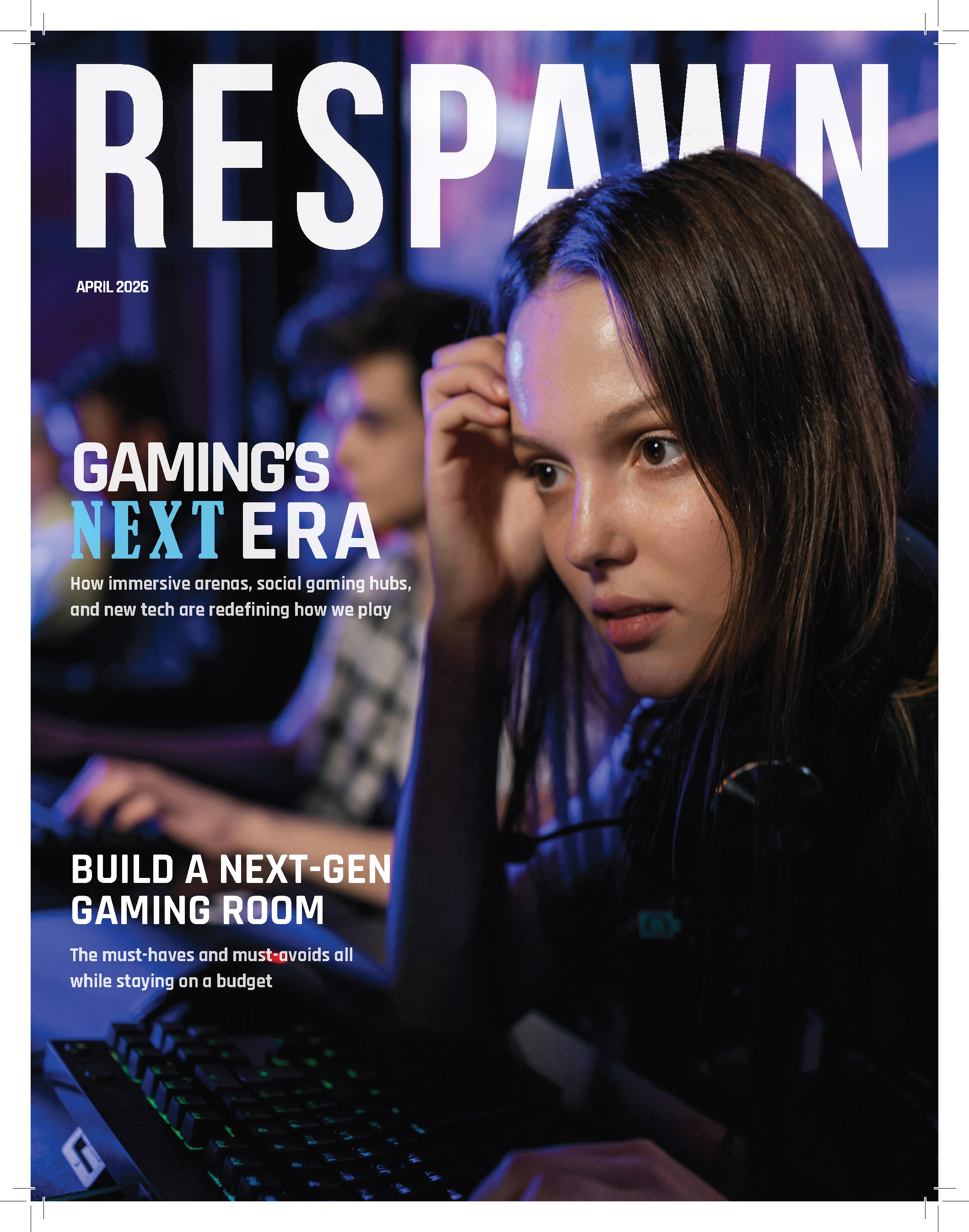
Respawn Magazine is an editorial design project focused on typography, visual hierarchy, spacing, and page composition.
The challenge was keeping the gaming-inspired layout energetic without letting type, imagery, and composition compete with the reading experience.
Typography, grid structure, spacing, and image placement were treated as one system. My role covered content organization, typographic hierarchy, composition, and final presentation.
Type choices and hierarchy were used to create clarity, rhythm, and emphasis throughout the spread.
Grid structure and spacing helped create balance between text, images, and white space.
The spread needed to feel bold and modern while still supporting an easy reading experience.
A polished editorial design that highlights strong composition, hierarchy, and typographic control.
The finished pages show the final relationship between typography, imagery, spacing, and composition, resulting in a polished editorial system with a clear reading flow.
